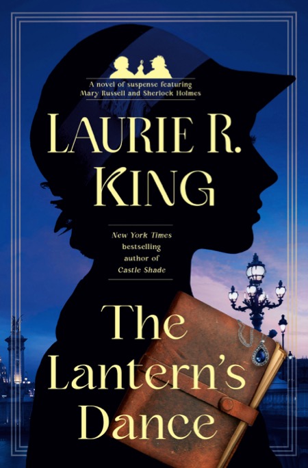
Not Just a Pretty Face: Cover Art
(Because what I do for a living often seems like magic—I come up with an idea and *POOF* the book’s in your hand—I thought I might do a series of blog posts (no spoilers!) about the actual process. (Though rest assured—it’s still pretty magical.)
In the publishing world, cover art comes before the book is even finished. My first draft was turned in April 1 (ridiculously short and incomplete—I talked about that here) and I had an in-depth editorial conversation on May 5 (the rewrite process, here.) But even while the book was in those malleable early stages, the art department was hard at work.
Now, a lot of publishing is in the how-the-sausages-are-made realm: you really don’t want to know. And what follows is probably firmly within that realm for most of you, since it’s all about the tiny shifts made in a cover from “Well, this is okay” to “Whoa, I love this!” But since this is a series of blogs about the minutiae of taking a book from idea to hardcover, today’s too-long post is all about what the cover looks like.
And trust me, as it is, I’m leaving a lot out. Including how many times I said thank-you to the art department.
May 19: I get a pdf attachment from my editor with an email, saying in part—
Excited to share two concepts for the cover of THE LANTERN’S DANCE. As discussed, we’re excited to try to find a bit of a new series look for Russell/Holmes, and here are two possible directions we could go. I think the second of these designs may prove more “repeatable” for a series look, but I do very much love the interpretation of the lantern in the first layout. Eager to hear your thoughts.
Zoetrope cover
Silhouette cover
May 24: After printing off the seven images, studying them, and having a chat with my agent, I write back—
I personally like the zoetrope concept, however, I don’t think 9 people out of 10 will know what it is. And I agree that it’s a good idea to start up a new series look that can be adapted for the next few books. So let’s go with some version of the silhouette.
What I would like to see here is something that both looks rich and evokes the exoticism of the story. At the moment, the silhouette cover only says “France” and “historical novel”.
(I do like the font of the name and title.)
- The silhouette itself: can we make it more clearly that of a woman in a hat? At first glance, it looks merely like someone with a lumpy hairdo. Also, for some reason this outline looks very young and girly. Maybe it’s the perky nose? The super-slim shoulders? Russell is a tall, strong woman of 25, and this figure looks ten years younger.
- I would drop both the Eiffel Tower and the street scene. If we decide that one part or the other needs the texture of an image, we can think about what goes but isn’t quite such a cliche. And, would it weaken it to remove the two art deco lines? Or if it needs lines, maybe four, as a frame?
- I like the silhouette as the basic series look—or various similar-but-different versions of the silhouette—that could then open it up to an image from each novel for the identifier. In this case, the lantern would be great (although when it comes to images, you should search for praxinoscope rather than zoetrope.)
- Colors: as I said, I strongly feel that the colors for this will be really important, and need to evoke the exotic. Maybe it would be appropriate to play with indigo shades?
- I understand that we want the Russell & Holmes logo on the cover, but perhaps it could be smaller, and its placement depend on what shape the hat brim ultimately has? I’d rather see the logo reduced, the author name shifted up, and in the middle some interesting/evocative image specific to this book, such as the lantern itself (or the journal, or a sapphire necklace, or…)
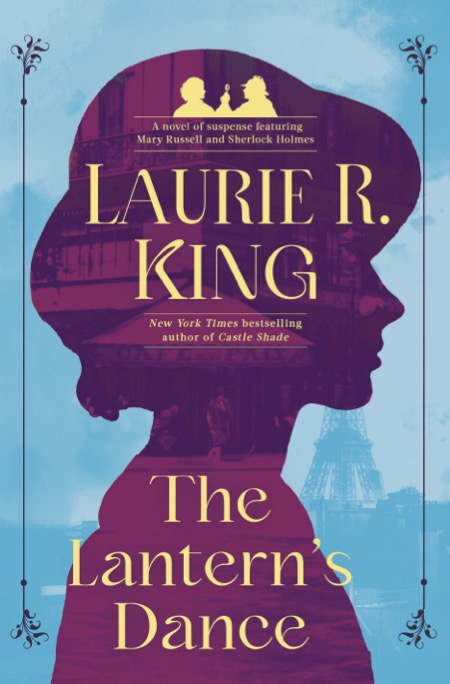
July 12: PRH sends a set of six revised covers based on the silhouette, with a reminder that we do want to indicate Paris on the cover. (Apparently, readers like Paris.)
#1
#3
#2
July 13: I send back my response—
Ooh, great colors. I asked for feedback from the focus group (Team LRK plus family)—their comments on the six different versions:
#1. (Favorite of 5 out of the 9) Tilted journal is great, blue necklace works; cheery colors of the sky
#2. Purple sky is great if we want to make it an “evening” flavor of book; one person noted that it makes it like Back to the Garden; glowing street lamps great; street lights on the right better?; people didn’t like the squared block of the journal
#3. (Favorite of 1 person) I’m not sure about the green—first I like it, then I don’t…
This version of the journal is better than #1 or #2—tilted, but shifted to allow the title to be read more easily
Going by the comments and my own preferences, I’d say:
Background color: I’m torn between the blue clouds and the sunset-purple. The one with the fresh sky says beach-read, the twilight one evokes mystery. Do any of you—or the others on the team—have any preference between the two?
But in general, consensus is:
Bridge/streetlamps rather than Eiffel Tower
The tilted & darker journal (as in #1)
Also the darker snap of #1—#3’s light snap draws attention to its anachronism (the ms has ties)
Shift the journal to the right, more like #3. Though maybe leave it the slightly larger size??
All of the words are clearer when they don’t actually touch the edge of the silhouette
I like the hair showing rather than the smooth silhouette
The jewel should definitely be blue
Maybe a shaded border like #5 and #3??
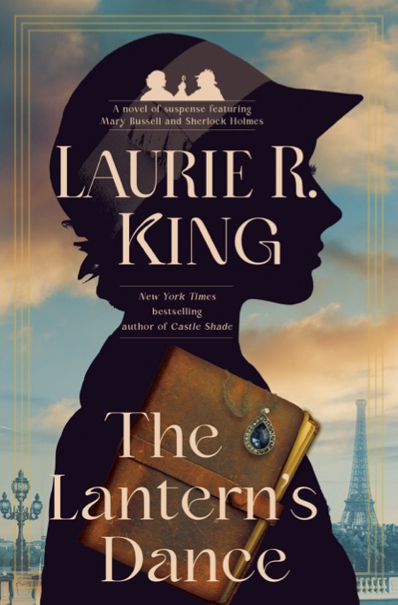
July 14: my long-suffering editor notes that the micromanaging author has requested—
One version with sky color of 1 (blue) and one with sky color of 2 (purple), both with Paris background lantern/buildings from 2.
Journal/jewel from 1 but with tilt of 3.
Lettering size and layout from 4
Silhouette from 1 and 2
Border from 3
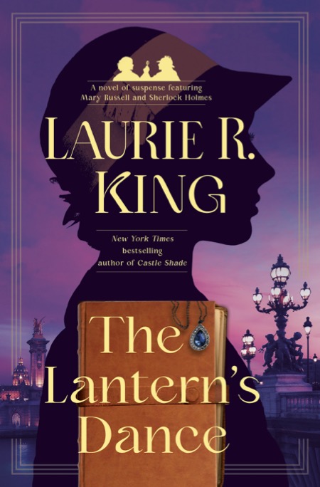
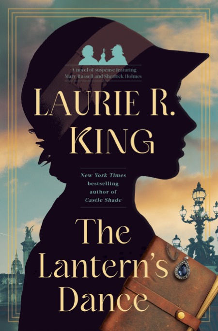
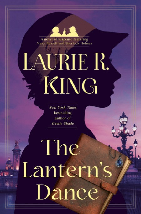
July 18: four versions arrive, two with the light-colored sky, two with the purple.
#1
#3
I write that I’m liking the glow of the streetlamps on the purple one, and ask if they have any preference.
July 19: my editor responds—
I like 1 and 3, but I like the tilt of the diary more on 1 and I think 3 is very close color wise to Island of the Mad? But I’m happy with either!
What about if they push #3 as blue as possible, so it doesn’t look like the magenta cover of Island, and make the diary a tad smaller? The diary in #1 forms a line with the edge of the silhouette, which looks odd—but I agree, I like the tilt there.
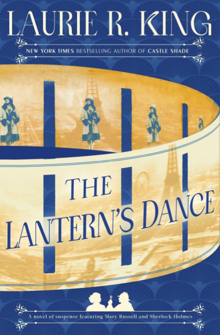
July 19: this one arrives—
July 19: I write back in return with—
That color is great, and the placement of the journal—thanks!
I do think we need a bluer hat band, a little closer to that of #3—the darker version fades into the black too much.
And, one last suggestion that entirely depends on how tweakable the background is: IF they can keep the right hand side as it is, but return a suggestion of those clouds on the left side of the figure, it would be nice. However—IF that makes the clouds on the right side wash out and lose their texture, then leave the sky / background as it is.
July 20: editor writes—
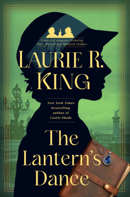
What do you think of the attached?! Do we have it?!
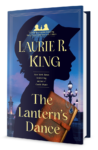
We have it.
And yes, I know, for some of those you’d need a magnifying glass to see the difference. However, I should add that I do love this cover, and furthermore, I don’t believe anyone in the art department either quit or was forced to take a leave of absence due to nerves.
**
You can pre-order The Lantern’s Dance from: Bookshop Santa Cruz (signed); Poisoned Pen Books (signed); Bookshop.org (supporting Indie booksellers); Barnes & Noble; or Amazon.
Genuinely, absolutely fascinating process! Now, looking forward to the Allison and Busby choice, too….
Me too!
L.
I like the result but I don’t care that much about covers. I can’t wait for the book. 🙂
janet
Hope you LOVE it!
My favorite part of this is the reference to “the next few books” !!! But also, as an artist/illustrator myself, this is EXACTLY the process I go through with my own pieces. I take photos of multiple versions, stare at them on the screen, ask my husband, pace, sleep on it, start all over, … and repeat. Finally, when I do get it, it seems like magic. There is a phrase from Oliver Wendell Holmes about “the simplicity that lies on the far side of complexity” and this is a great example.
That makes me feel better, that I’m not just being a micromanager…
I love the chosen one, except for the logo, which seems too big and bright.
I must say that I’ve often bought the British version because I didn’t like the American cover.
Love all the books — and “Back to the Garden” also. And it was very interesting to see the process.
I did suggest they make it smaller, but…
Such attention to detail. I’m impressed, and I love the results.
Me too!
So interesting to see the process. I am so glad you have the bridge lights rathe than the overused tower. Tweaking the colors, hat band, and the sky are exactly how I would choose. Well done art department, editors and LK! Looking forward to catching up to Mary.
Glad you agree, though I’m not sure the lamps necessarily tell most people that it’s in Paris.
I first discovered Russell back inthe 90’s when I moved to a new town, whose library was housed in a dingy old building with abysmal lighting. Russell #2 was “featured” on the end of a row, I grabbed it as it looked pretty new and I was intrigued by the title, which is about all I could see on the cover, which was fortuitous, as out in the sunlight I saw the trad Holmes silhouette, and I nearly returned it on that alone.
Happy to admit my prejudice s were totally inaccurate, but it certainly highlights the impact of cover art!
Should I say, I’m glad you couldn’t see? But yes, some of the covers leave a lot to be desired.
I have read and re-read all the Mary Russell books multiple times. I am not sure how I discovered them originally. Some of the covers I have liked more than others. This one is superb! I loved hearing about the process. I am glad you were able to keep on honing to get to the best one. Eager to read it! I usually buy the ebook right away, and later listen to the audio book through my library.
I do so love posts of this kind! Cover art is an art form of itself, because it has to satisfy multiple needs at once: communicative, illustrative, and the ever elusive evocative.
Gosh, that sounds overwrought … but I do love the final cover!
If I had never read a Russell title before, I would pick this one up on basis of the color scheme alone (a beautiful balance of red, yellow, and blue). The composition has really nice triangles/diagonals in it, too. They catch your eye and draw you in and I wouldn’t be able to help myself: I’d make a story off that cover, open the book to read the flaps (to see if I came close), and open my wallet to take the book home.
And–full disclosure–blue is my favorite color and the blue on the cover has perfectly captured that smouldering twilight hue. ♥
It really is a wonderful cover and I can’t wait til the book is released. Are there any plans to release the cover image as a poster? I would love to have one!
Because it is!
Hi Mary, I’m glad you love this cover as much as I do. There’s a fair amount of merch on the LRK Cafepress store (https://www.cafepress.com/laurierkingauthor ) but I’d hesitate to buy a full-sized poster, since I’d guess that would require a really REALLY high-res original.
Maybe a coffee mug would do?
Hope you enjoy the book itself!
Laurie
I love the Russell and Holmes series! I’m working to have a physical copy of the whole series, so far I’ve collected 18 books. Are there any printed (not ebook) options for The Mary Russell Companion, the Marriage of Mary Russell, Mary’s Christmas, Mrs. Hudson’s Case …and any other short stories in the series?
Hi Lorinda, the Companion is not in print (we’re thinking of it, but it will take a lot of work to update it…) but the other three stories plus a load of others are in the anthology, Mary Russell’s War. Enjoy!
Laurie King
Thank you! I really enjoy Mary Russell and SH! I’ve ordered 2 more printed copies to keep growing my collection, until it is complete.